Blog /How to Choose Kitchen Countertops by Color and Material
How to Choose Kitchen Countertops by Color and Material
We don’t always notice it at first, but the countertop sets the emotional tone of a kitchen. It’s where our mornings begin with a quiet cup of coffee, and where conversations linger long after dinner ends. Beyond function, the surface you choose defines the space’s personality: bold or understated, warm or sleek, timeless or playful.
This isn’t just about practicality — though that matters too. It’s about how materials feel under your hand, how colors shift with the light, and how your kitchen becomes a reflection of your rhythms and rituals. Whether you’re starting from scratch or refreshing a beloved space, the right countertop can anchor your entire home.
Let’s explore how color and material come together to create not just beauty — but atmosphere.
1. The White Spectrum: From Clinical to Cosmic
Pure White
White countertops have long been the favorite of minimalists and modernists alike. They give kitchens a gallery-like stillness – a sense of pause and clarity. Pure white surfaces reflect natural light like snow in sunlight, expanding tight spaces and sculpting shadows.
In dark cabinetry kitchens, they serve as a dramatic counterpoint, highlighting architectural details and sharp lines. But beauty comes with expectations: every speck of dust becomes visible, and surfaces must be tended to with care. Still, for many, the reward is a kitchen that feels clean, open, and timeless.
Design Feel: Crisp, modern, architectural Pairs Well With: Matte black cabinetry, brushed nickel fixtures, minimal decor, wood Best For: Small or low-light kitchens needing visual expansion Care Level: High – visible staining, sensitive to wear
Courtesy Spruill Homes
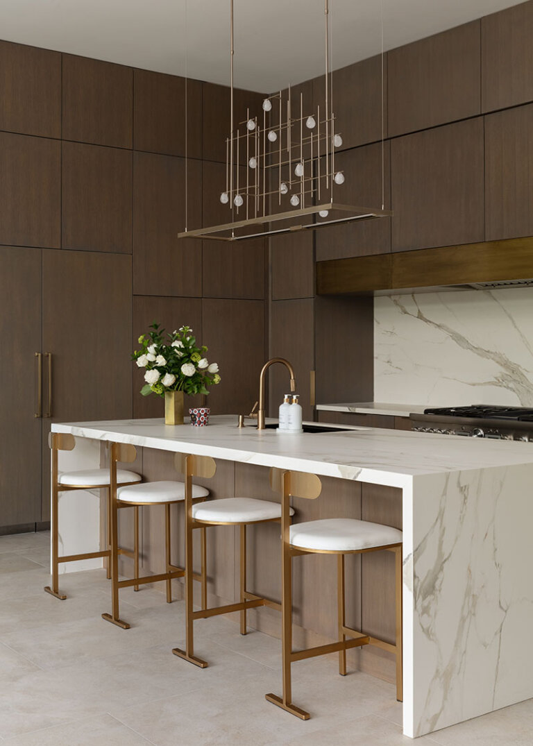
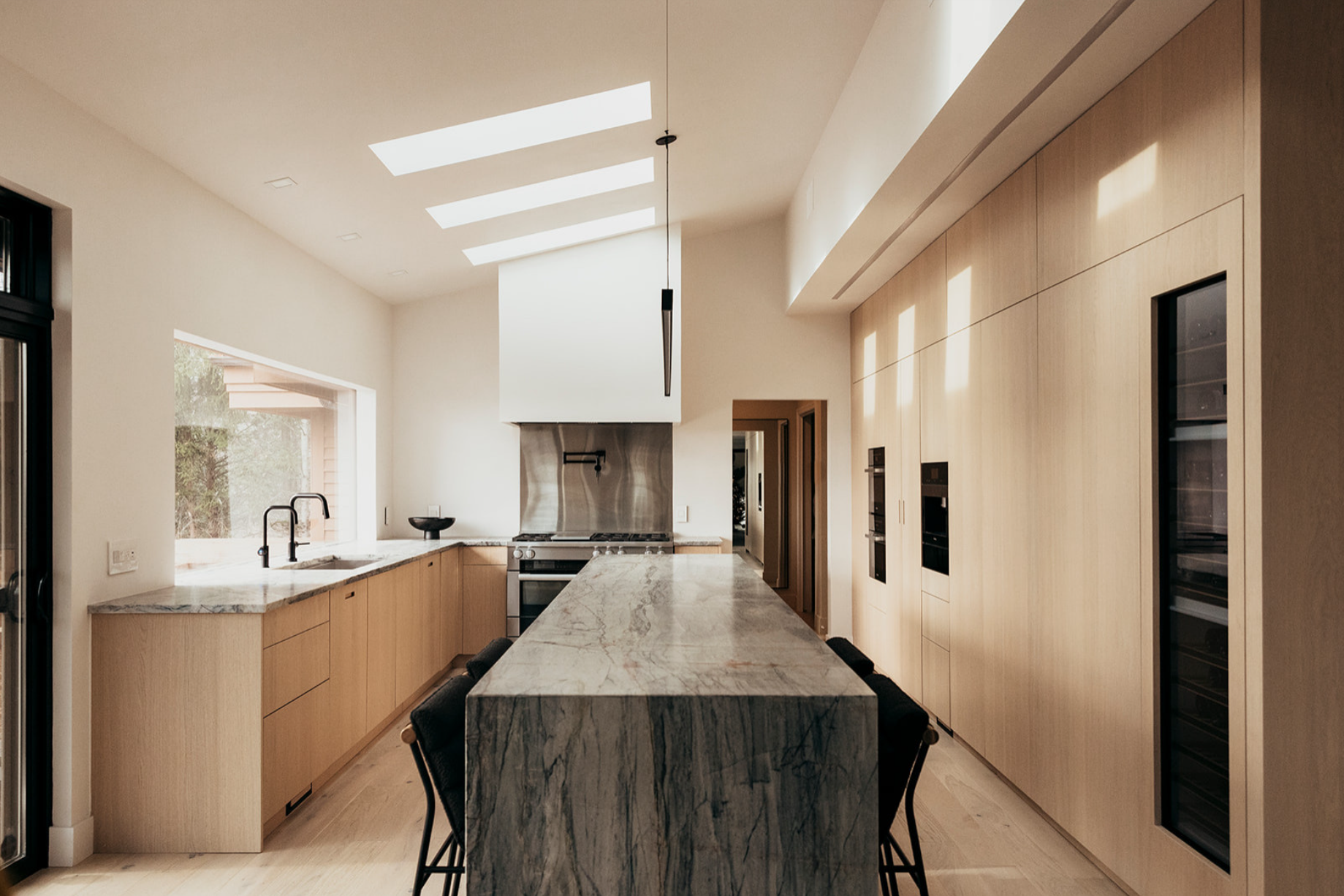
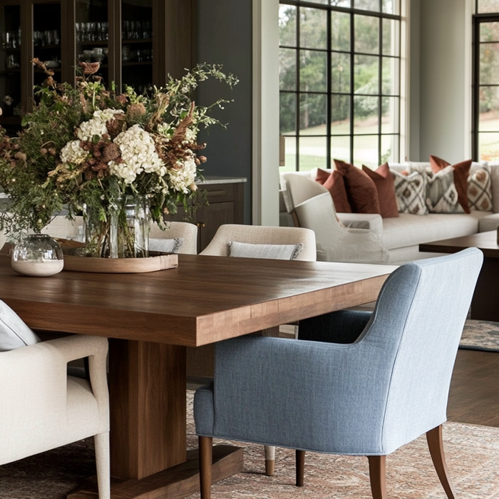
Veined Whites: Nature’s Calligraphy
If pure white is a canvas, veined marble is the artist’s hand. Swirling veins in silver, charcoal, or amber give a surface life and motion – evoking rivers, branches, or geological layers. These patterns break the sterility of white, making the kitchen feel more organic, more storied.
Horizontal veins calm the space like a quiet horizon. Vertical streaks draw the eye upward, bringing energy. Cloud-like formations soften the palette, creating a gentle, almost romantic atmosphere.
Courtesy M Architecture
Material Spotlight:
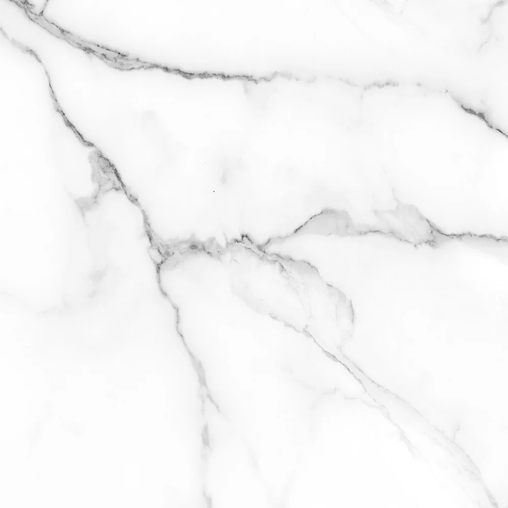
Carrara Marble: Soft, historic, and full of soul. It wears with time – developing a character-rich patina that designers often consider a feature, not a flaw.
Quartz: Clean and bright with less maintenance. Offers the clarity of white with the durability of engineered stone.
Nano-Glass: Ethereal and ultra-modern. Its slight translucency adds a futuristic dimension, but the surface is unforgiving to impacts.
Carrara Marble
Quartz
Nano Glass
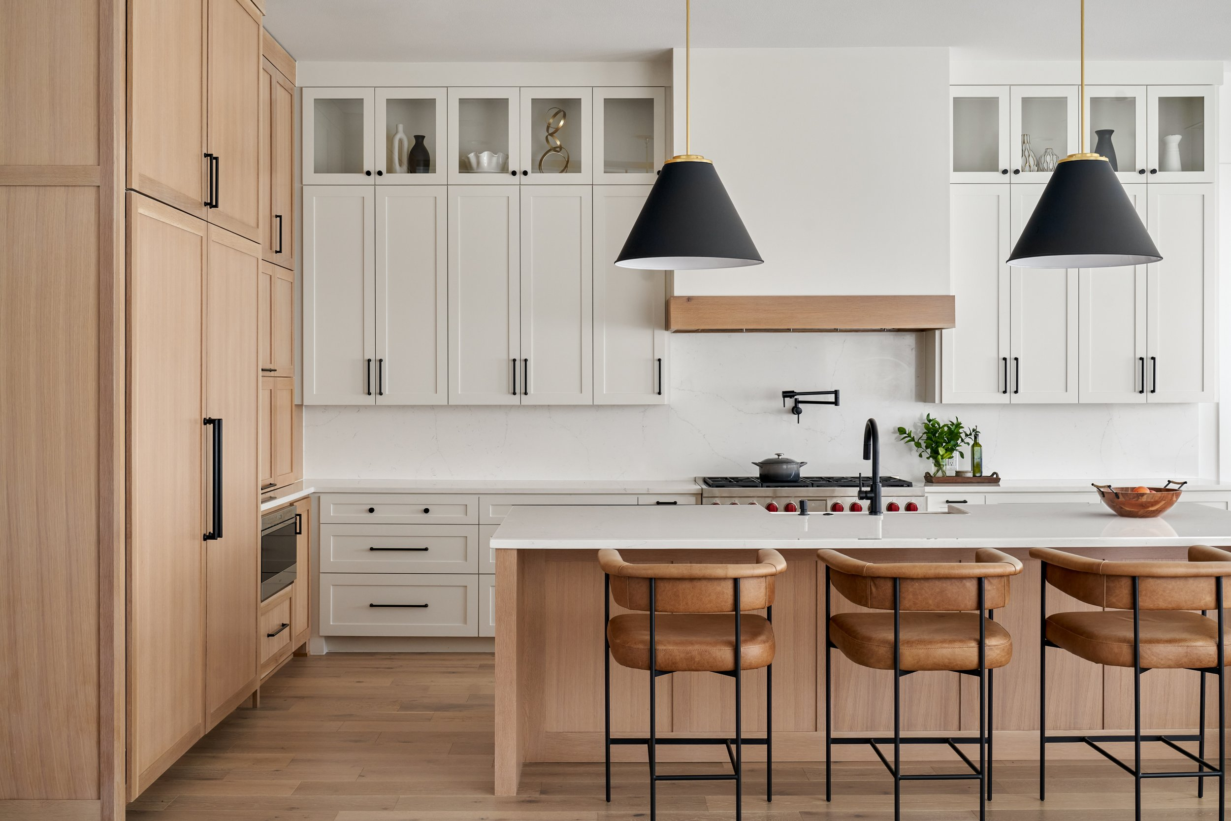
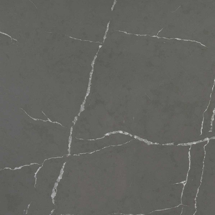
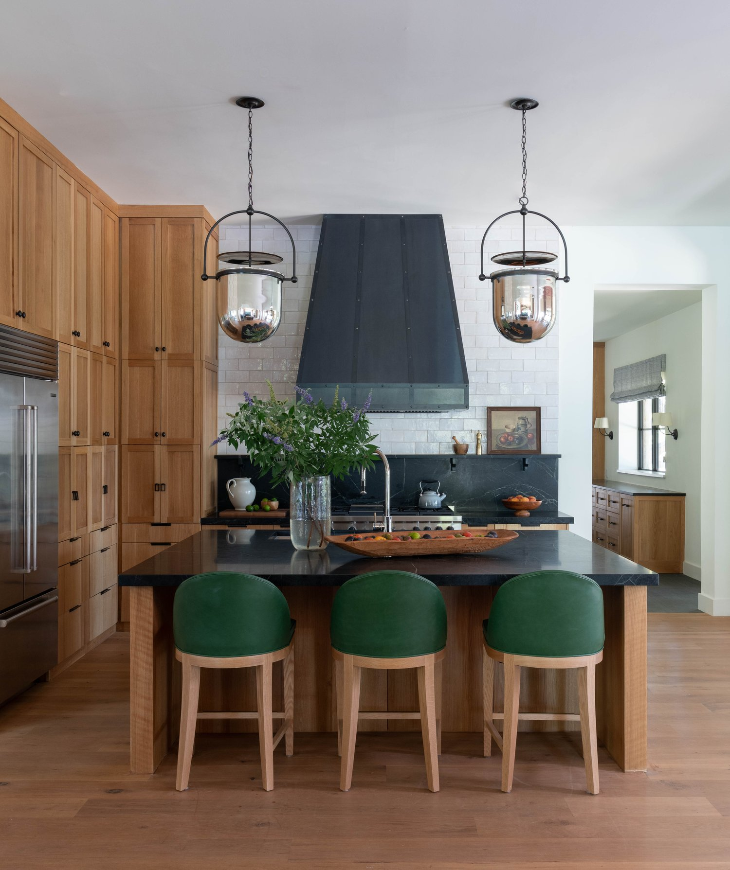
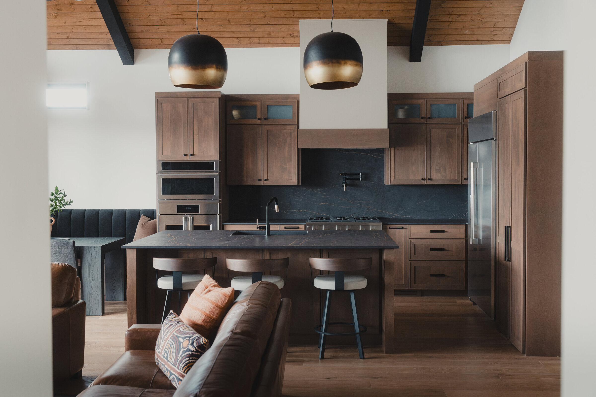
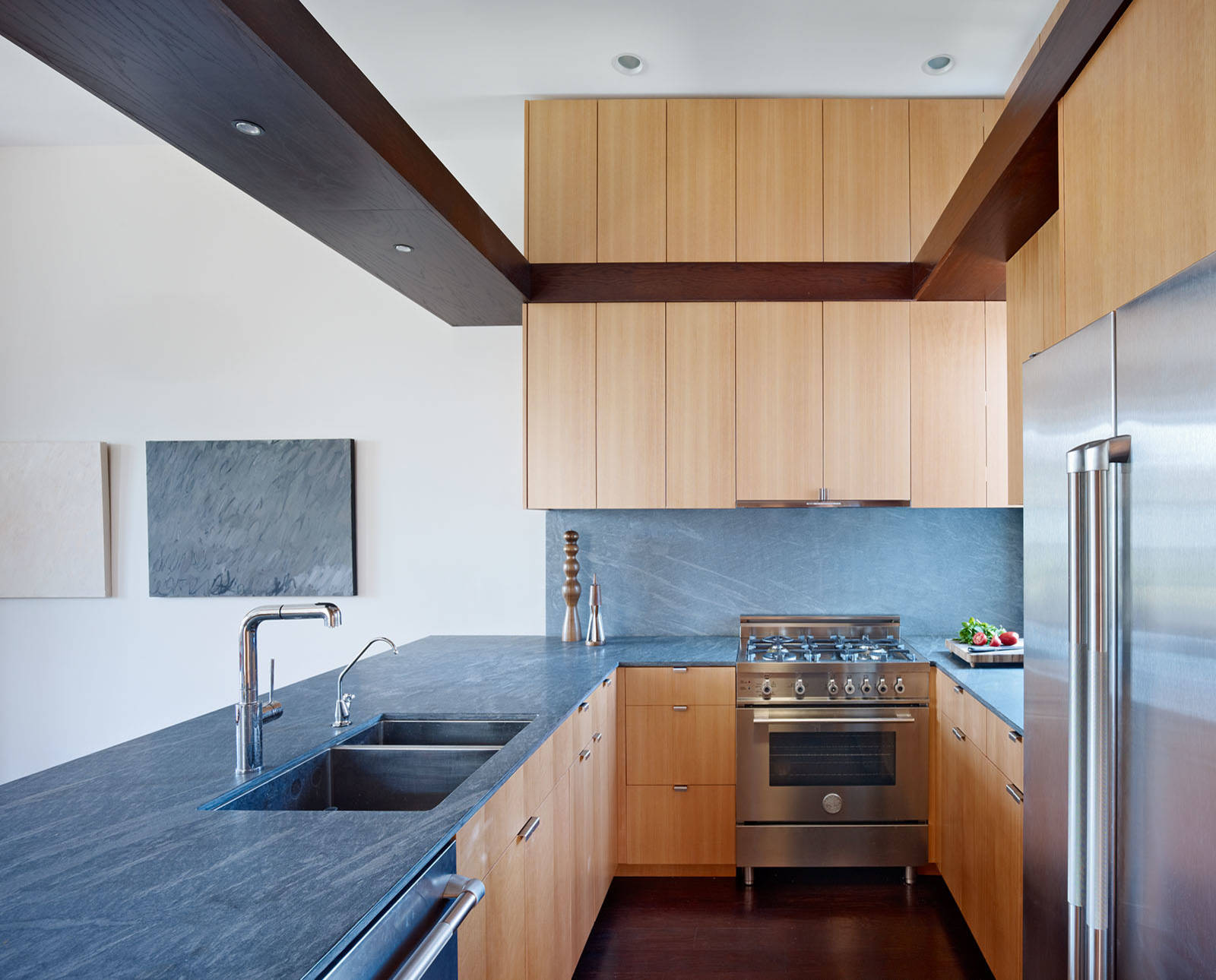
2. Gray: The Chameleon Neutral
Why Gray Works
Gray is a color of nuance. It can read as warm or cool, soft or bold, depending on the context. That makes it a favorite for designers crafting transitional spaces – ones that blend rustic charm with urban edge.
Gray countertops support the rest of the kitchen rather than steal attention. They anchor a palette of woods, metals, or pastels, adapting to the home’s emotional temperature.
Blue-gray: Stormy and modern, ideal for sleek kitchens with stainless steel.
Green-gray: Evocative of mist over moss, brings calm and earthiness.
Taupe-gray: Classic and comforting, perfect for layered, cozy interiors.
Design Feel: Versatile, grounded, subtle Pairs Well With: Wood floors, industrial metals, or painted cabinetry Care Level: Low to medium
Courtesy DB Design Center
Material Spotlight:
Polished Concrete: Each slab is a unique expression. The mottled surface and patina bring a hand-crafted, architectural feel – ideal for lofts or creative studios.
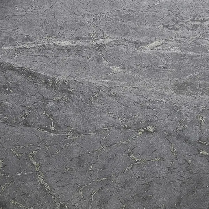
Soapstone: Feels aged yet elegant. The darkening effect from oils adds richness, like well-worn leather.
Quartz (Cambria Torquay): Quietly luxurious, soft under lighting, and easy to maintain.
Courtesy NR Interiors
Polished Concrete
Soapstone
Quartz
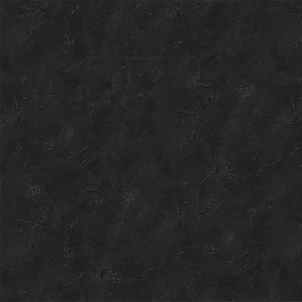
3. Black: The Velvet Void
Bold and Absorbing
Black countertops are a statement. They absorb light instead of reflecting it, grounding the kitchen in drama and intensity. In well-lit spaces, they create contrast and elegance – a kind of visual silence that allows other materials to shine.
They’re often used to frame bright colors or natural textures, enhancing their vibrancy. But in darker or smaller kitchens, black can feel heavy if not balanced with ample lighting and reflective surfaces.
Design Feel: Luxe, modern, cinematic Pairs Well With: Emerald green, brass hardware, white tile Best For: Bold designs, large kitchens, statement islands Care Level: Medium – water spots and fingerprints show
Courtesy Monika Merchant Design Studio
Courtesy Ginger Designs
Material Spotlight:
Absolute Black Granite: Timeless and tough. Elegant when honed or polished, but shows smudges easily.
Basalt: Raw and tactile, with subtle volcanic texture. Stays cool – ideal for baking and pastry work.
Black Stainless Steel: Industrial-chic and heat-efficient. Sleek and unexpected.
Absolute Black Granite
Basalt
Black Stainless Steel
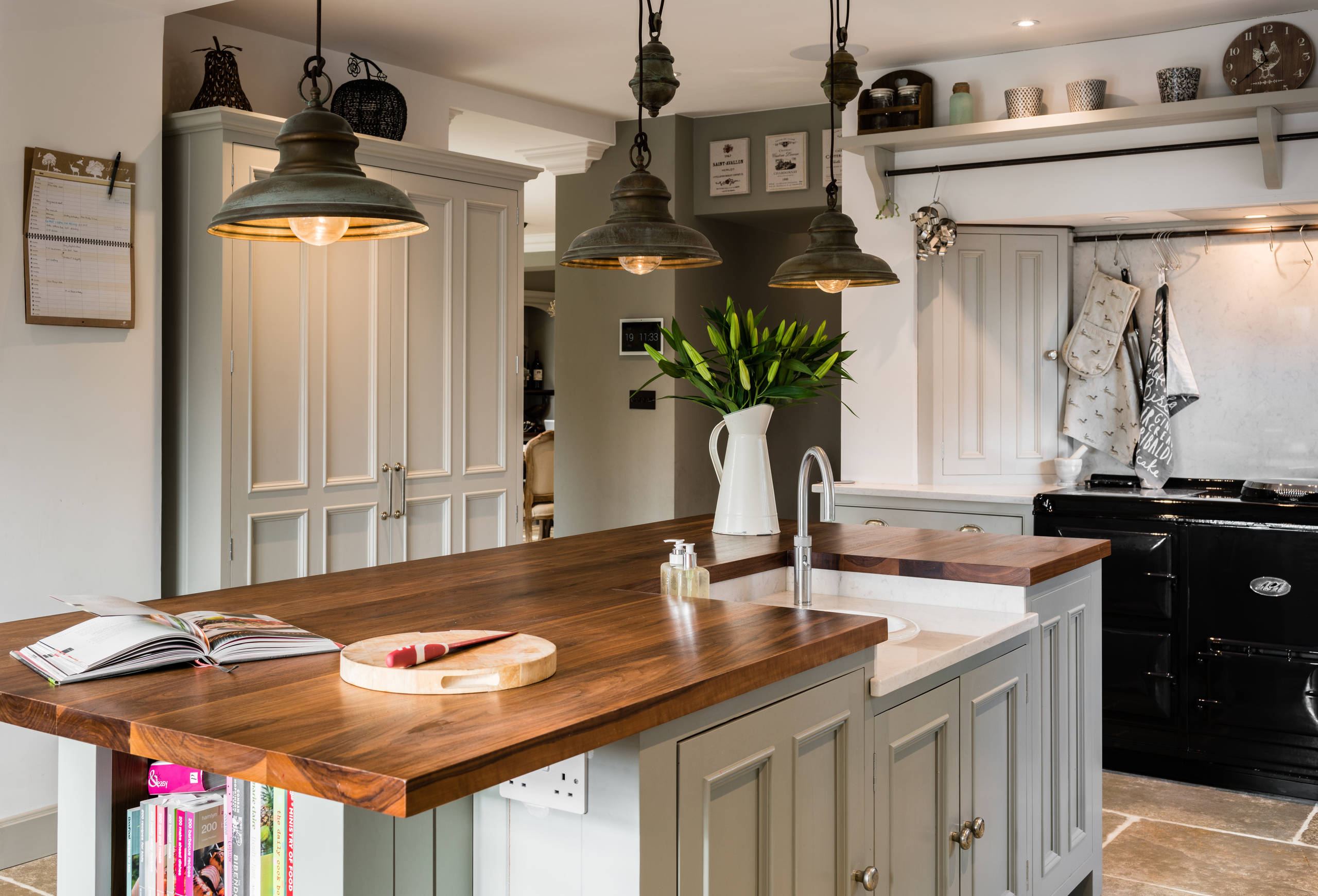
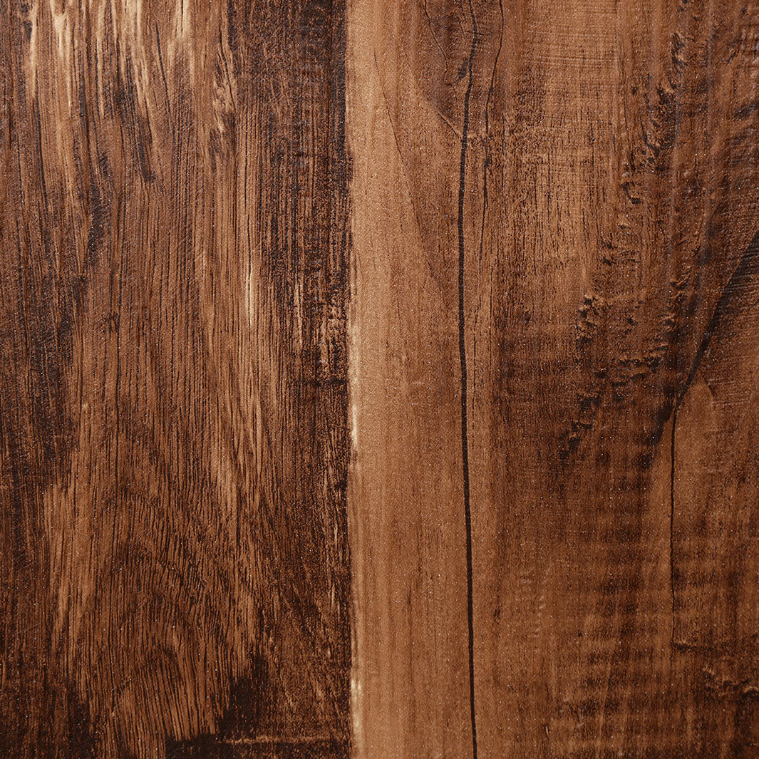
4. Wood: The Warm Interlude
The Living Surface
Where stone seeks permanence, wood embraces change. It’s warm under the hand, rich with texture, and emotionally resonant. Each board tells a story – of growth rings, weather patterns, or human touch. In kitchens, wood brings humanity.
Designers use it to counterbalance the hard surfaces of tile and metal. Over time, wood darkens, scuffs, and shines with polish – reflecting the rituals of daily life.
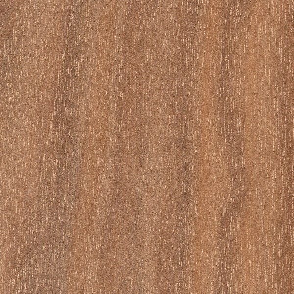
Maple: Clean and consistent grain. Works well in light, Scandinavian spaces.
Walnut: Deep and dramatic. Beautiful in contrast-heavy kitchens.
Oak: Rustic and characterful. Perfect for farmhouse or historic homes.
Courtesy Hill Farm Furniture
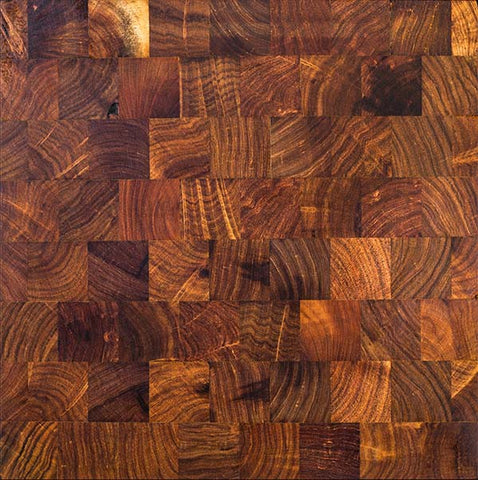
Material Spotlight:
End-Grain Butcher Block: A practical workhorse that doubles as a cutting surface. Needs oiling, but rewards you with beauty.
Live Edge Slabs: Sculptural and expressive – often used for dramatic islands.
Reclaimed Barnwood: Rich in texture and soul. Each imperfection tells a story.
Design Feel: Cozy, organic, soulful Best For: Homes with natural materials, artisan details Care Level: High – sensitive to heat and moisture, but easy to refresh
End-Grain Butcher Block
Live Edge Slabs
Reclaimed Barnwood
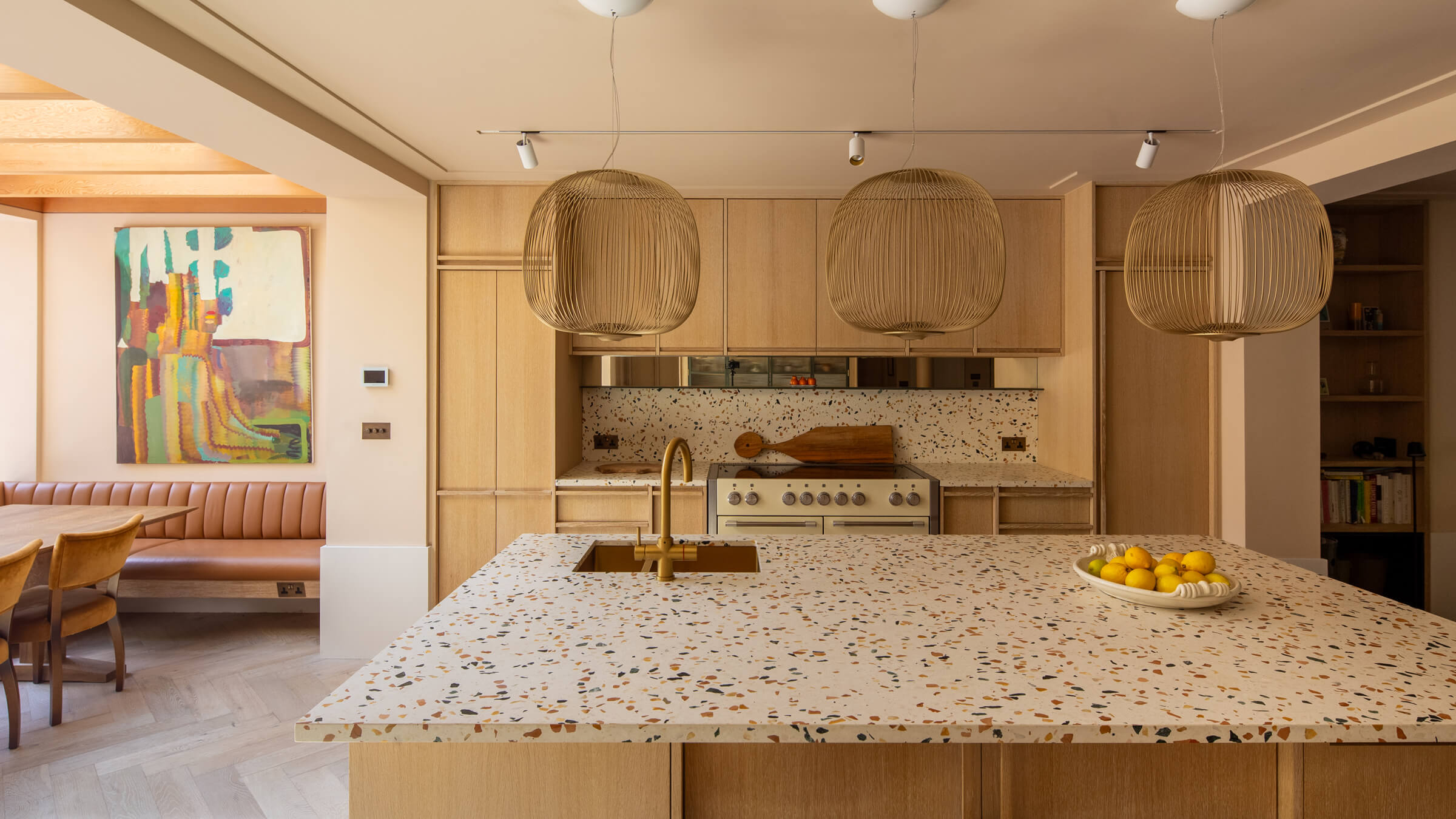
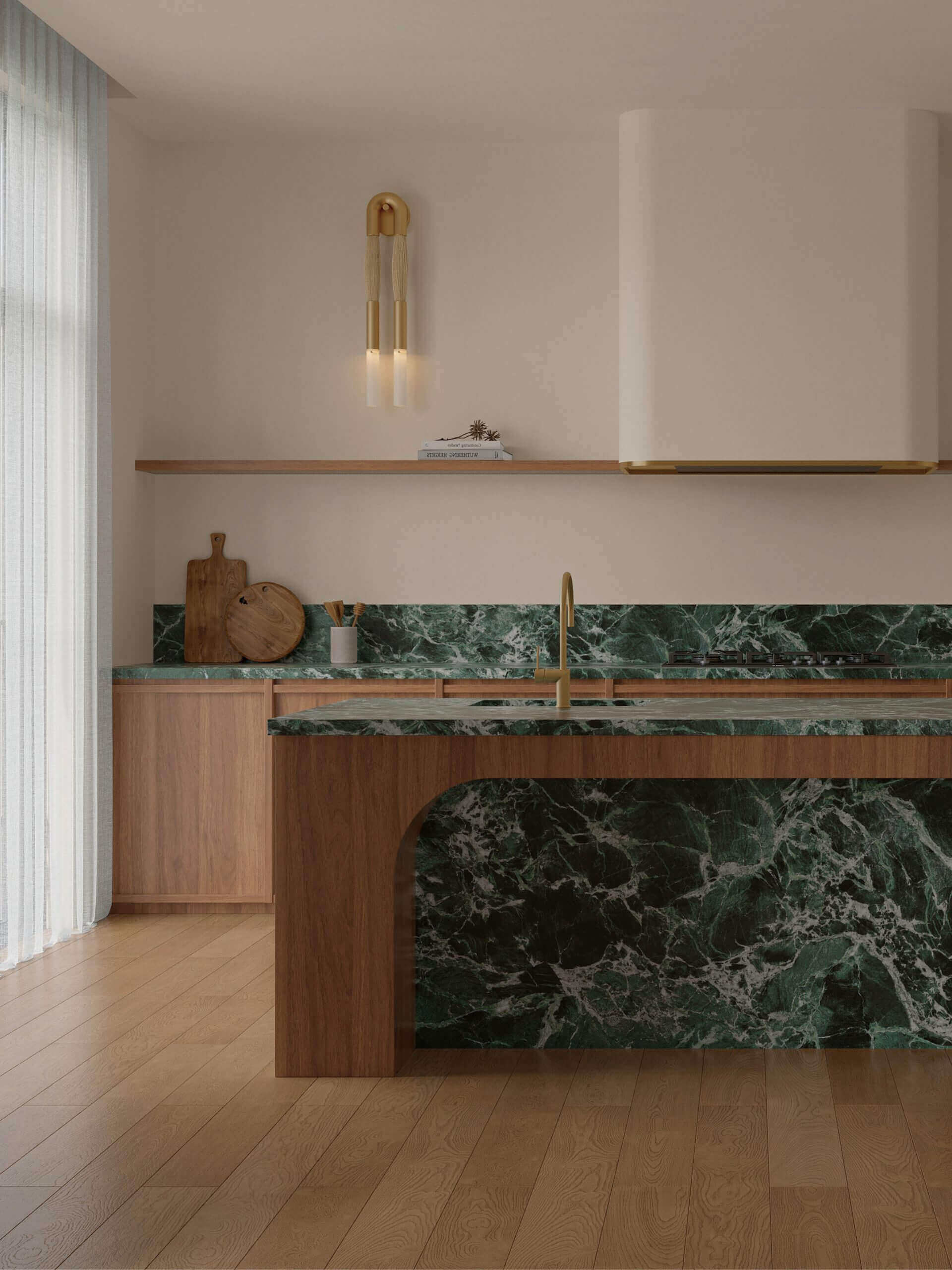
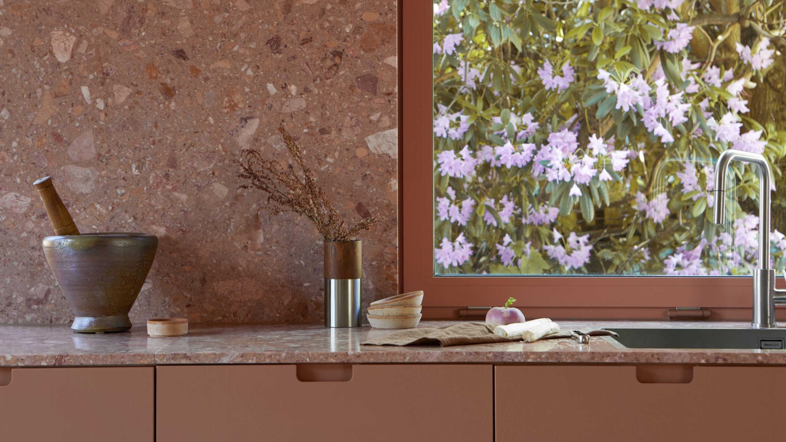
5. Accent Colors: Statement Surfaces
Sometimes, the countertop is the centerpiece. A bold surface color can define the whole kitchen – especially on an island or feature wall. Accent countertops are jewelry for your space.
Emerald Green
Material Match: Vermont Verde marble or deep green quartz
Design Feel: Luxe, forest-inspired, grounding
Burnt Orange
Material Match: Terracotta composite, ceramic surfaces
Design Feel: Inviting, earthy, nostalgic
Midnight Blue
Material Match: Lapis terrazzo, dyed concrete
Design Feel: Dreamy, mystical, modern
Use these tones sparingly, or balance them with neutral cabinetry and soft lighting for elegance without overwhelm.
Courtesy Lavistone
Courtesy HIMLEKÖK ÖRGRYTE
Courtesy jones | haydu
Epilogue: The Touch Test
If you’ve ever run your hand across cool stone in the morning or leaned on warm wood during a quiet evening, you already know: materials speak. They speak through temperature, texture, and the way they age.
So before choosing, take time to visit showrooms or stone yards. See how a slab shifts in the light. Touch it. Tap it. Let your senses decide what feels right.
Because in the end, your kitchen is not just a space – it’s an experience. And the surface you live with every day should be one that welcomes your touch, fits your rhythm, and quietly tells your story.
Looking for Valentine’s Day decor ideas for every room? Discover how to decorate your bedroom, bathroom, kitchen, and living room with romantic touches that
Looking for Valentine’s Day decor ideas for every room? Discover how to decorate your bedroom, bathroom, kitchen, and living room with romantic touches that
In 2025, Christmas Decor Trends are redefining holiday interiors. From the chic simplicity of velvet bows to the magic of shimmering icicles, these ideas